Imitation is NOT the Sincerest form of Flattery
In April 2021, Van Leeuwen brought a lawsuit against keto ice cream brand Rebel. The lawsuit claimed Rebel mimicked Van Leeuwen’s distinctive branding: a pastel-colored, monochrome pint design with the company’s name in contrasting black cursive script. Van Leeuwen did not allege that Rebel copied its name or logo. Instead, it asserted that the commercial impression created by Rebel’s packaging infringed its protectable trade dress rights.
On July 16th, Van Leeuwen won the case and was awarded approximately $23.8 million in profits attributable to Rebel Creamery’s sales.
The ruling also permanently enjoined Rebel from selling products with packaging likely to be confused with Van Leeuwen’s trade dress, and ordered Rebel to redesign its packaging.
One defense Rebel tried was that it adopted its packaging in good faith and that any similarities were coincidental. Judge Komitee found the argument “infinitesimal,” and called the founders’ account of their process “clearly fabricated.” That’s because the design firm Van Leeuwen hired brought the briefs, the presentations, the design files, the rejected concepts, and each successive round of revisions — while Rebel brought... well, nothing. Its founders testified that they built their packaging in Adobe Illustrator, but produced no sketches, no mockups, no earlier versions. Only the finished design.
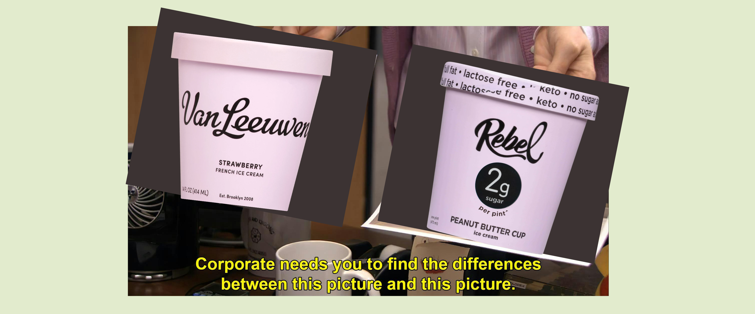
This is a big lesson for brands and designers everywhere: document everything. Inspiration is everywhere, and even if Rebel had a mood board with Van Leeuwen on it, they would at least have had something to point to and say “yes, we got inspiration from them, but look at everything else we did.” With no evidence of their design process, it seems likely they just plainly copied Van Leeuwen’s design.
Which brings me to this question: what is your brand, what is your business, if you’re relying on copying the work of others? And what happens when you miss the point of what you’re copying in the first place?
There’s no doubt that studying your competition and other players in the market is important. As Emma Grede says in her book Start with Yourself (and I’m paraphrasing, because so far I’ve only listened to it and don’t own a copy — yet), you shouldn’t look to competitors for direct inspiration — instead, look into why what they do works.
Rebel copied Van Leeuwen because they saw the pastels and the font as an aesthetic people wanted. They saw the uniqueness of every flavor having its own color winning over audiences. Instead of copying the equation, they copied the answer.
What they should have done instead is look at why those things work. First and foremost: it’s different. Every other ice cream brand uses the same packaging across every flavor, with maybe a small design tweak to reflect the flavor itself (a vanilla bean on vanilla, a chocolate square on chocolate). So instead of copying what Van Leeuwen did to stand out, Rebel could have figured out what would make their own design different. There are a million creatives out there with fresh ideas who cost way less than $23.8 million to hire.
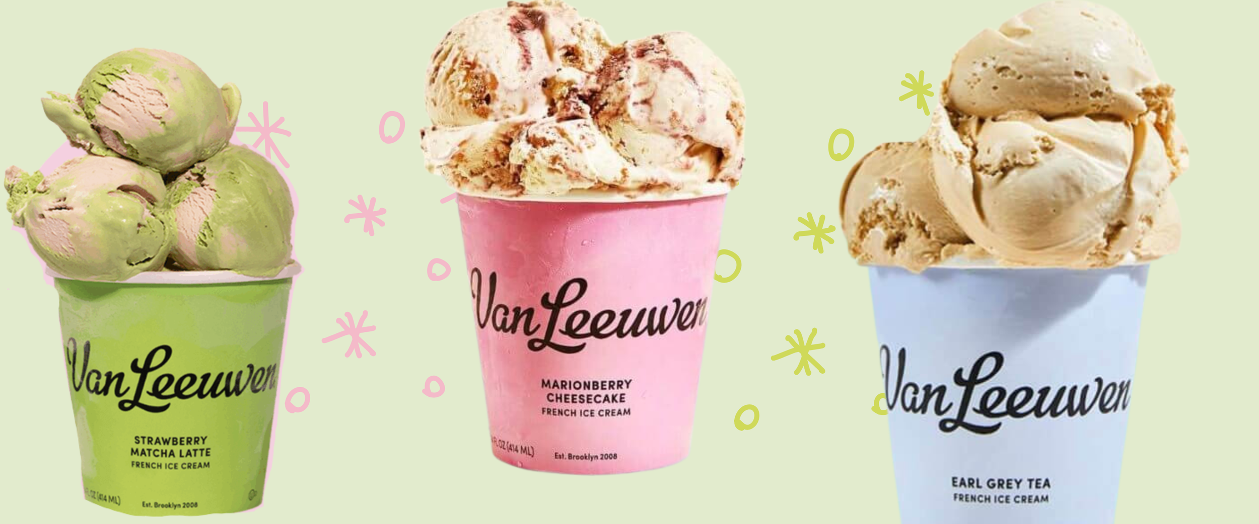
On top of that, Van Leeuwen’s design reflects the product it’s promoting. The pastels and the font choice say classy, elegant, boujie — and the flavors back that up: strawberry matcha latte, marionberry cheesecake, Earl Grey tea, just to name a few. Rebel, meanwhile, has your typical ice cream flavors — peanut butter cup, mint chip, chocolate — and they’re all keto. They’re a health-forward ice cream brand. The branding they copied serves a purpose for Van Leeuwen, but it doesn’t fit the product Rebel is selling.
Additionally, what happens when someone gets the branding confused? Your partner has just broken up with you. Tear-stained and foggy-brained, you go to the store for rich, creamy, full-fat, full-sugar ice cream. You leave with Rebel. First spoonful in, you’re met with no sugar, low fat, keto ice cream. That did it. It’s time for bangs.
In fairness, people do read labels — 99% of the time they’ll know Rebel is keto and Van Leeuwen isn’t. But you don’t want your customers feeling confused. Even if they eventually land on the right product for them, figuring out the difference between the two takes effort. It’s friction, and it makes the buyer journey longer — instead of customers being able to just walk in and choose your product.
Lastly, copying someone’s branding can only get you so far. The product has to do the rest. Even if Van Leeuwen had lost the lawsuit and Rebel kept their branding, they’d still have to have a good product. Van Leeuwen is lasting because people LOVE their product, not just their design — will Rebel be able to do the same? (probably, the ice cream alternative market is huge right now)
For brands just getting started, take two things away from this: document, document, document!!!!
And: you don’t need to copy someone else to stand out. In fact, doing so can and will cost you. Instead, take note of what your competitors or similar brands are doing, and dig into the why behind their success. That’s what will actually help you build a product that stands out.
Ready to make your brand standout? Click here to schedule a free social media design consultation.
Resources: